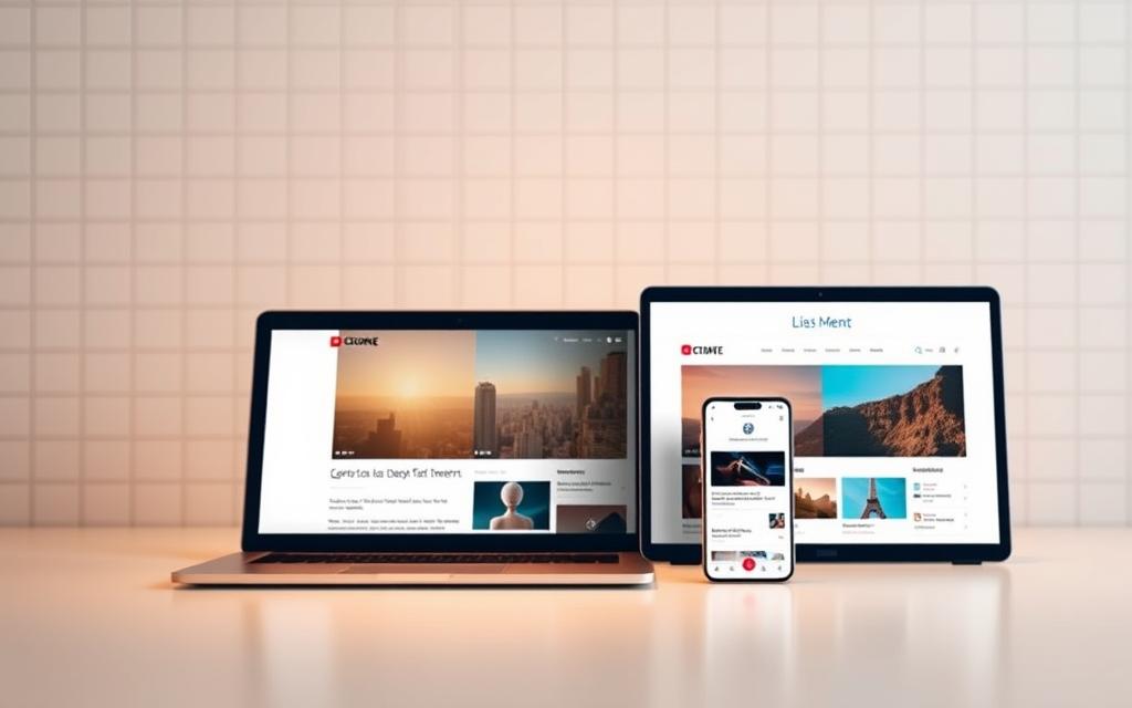
Mobile-first design is no longer optional. With over 60% of web traffic coming from smartphones, your website must adapt seamlessly. Google prioritizes mobile-friendly sites in search rankings, making responsive layouts essential for visibility.
A well-crafted theme uses CSS media queries and fluid grids to rearrange content dynamically. This ensures crisp displays on any screen size, from compact phones to widescreen desktops. Studies by WP Engine reveal optimized themes load 50% faster, directly impacting user retention.
This guide simplifies the process of building adaptable layouts while maintaining aesthetic appeal. You’ll learn to balance technical precision with intuitive navigation, ensuring visitors enjoy smooth interactions across devices.
Google’s algorithm rewards sites that deliver flawless mobile experiences. With 55% of global traffic coming from smartphones, a rigid layout can cost you visitors. Responsive design ensures content adapts to any screen, from smartwatches to 4K monitors.
Why Responsive Design Matters for Modern Websites
Google’s 2023 Core Web Vitals prioritize mobile usability. Sites failing these metrics drop in rankings. Mobile users convert 15% less often on non-responsive pages. The fix? A flexible layout that rearranges itself dynamically.
This tells browsers to match the screen’s width, preventing zoomed-out or cropped content.
How WordPress Themes Adapt to Different Devices
Fluid grids use percentages instead of fixed pixels. A 25% width division scales perfectly on a phone or desktop. CSS media queries activate at breakpoints like 320px (mobile) or 1024px (laptops).
WordPress themes leverage these tools to resize images, collapse menus, and stack columns. Test by resizing your browser—if elements reflow smoothly, your theme passes.
How to Create a Responsive WordPress Theme
Fluid layouts are now standard for seamless user experiences. With diverse devices flooding the market, your design must adjust effortlessly. Leveraging CSS and media queries ensures content looks polished on any screen.
Mastering Media Queries for Dynamic Displays
Breakpoints define when layouts shift. Start mobile-first with min-width queries to prioritize smaller screens. Here’s a common structure:
srcset: Delivers optimized files based on screen size.
max-width: 100%: Prevents overflow.
Legacy browsers like IE11 need fallbacks. Polyfills and vendor prefixes ensure compatibility.
Essential Tools for Building Responsive Themes
Building adaptive layouts requires the right toolkit for efficiency. Plugins and frameworks accelerate development while ensuring cross-device compatibility. Below are curated solutions to streamline your workflow.
Top WordPress Plugins for Mobile Optimization
WPtouch instantly creates mobile-friendly versions without altering desktop layouts. Priced at $45+/site, it supports AMP and push notifications. For app conversions, WP Engine recommendsAppPresser, turning sites into iOS/Android apps.
Visual builders like Elementor and Divi simplify responsive editing:
Plugin
Best For
Key Feature
Elementor
Drag-and-drop flexibility
Extensive widget library
Divi
Pre-made templates
Global style controls
CSS Frameworks to Simplify Responsive Design
Bootstrap 5 offers a 12-column grid system, ideal for fluid layouts. Integrate it via functions.php for seamless scaling. For a lean foundation, the Underscores starter theme provides semantic HTML5 and mobile-ready structure. Learn more about starter theme structures.
Browser-sync: Test changes in real-time across devices.
Flexbox/Grid: Modern CSS for dynamic arrangements.
Optimizing Performance for Responsive Themes
Speed is the backbone of user retention in today’s digital landscape. Studies show 53% of mobile users abandon pages taking over 3 seconds to load. Performance tuning directly impacts search rankings and conversion rates.
Streamline Network Requests and Loading
Reducing the number of HTTP requests slashes load time. Combine CSS/JS files and leverage browser caching. WP Engine reports lazy loading improves mobile speed by 40%:
“Deferred loading for images/videos cuts initial payload by 60%, prioritizing visible content.”
Images often dominate network bandwidth. WebP format reduces file sizes 30% versus JPEG without quality loss. Implement these steps:
Tool
Function
Impact
ShortPixel
Auto-converts to WebP
70% size reduction
Smush
Lossless compression
Faster pages
CDN
Global asset delivery
Lower latency
For deeper analysis, audit render-blocking resources using Chrome Lighthouse. Enable GZIP compression in .htaccess to shrink code transfer sizes.
Choosing the Right Responsive WordPress Theme
Premium solutions eliminate guesswork in cross-device compatibility. WP Engine’s curated collection demonstrates built-in responsiveness across all screen sizes. The ideal framework balances aesthetic control with technical precision.
Key Features to Look for in a Theme
Look for fluid grid systems with documented breakpoints. Premium themes often include:
Mobile-optimized navigation (dropdown vs off-canvas)
Touch-friendly form elements with proper spacing
Dynamic product grids for WooCommerce
The TablePress plugin handles complex tables elegantly. Development teams should verify:
“Responsive menus must maintain 44px touch targets on mobile.”
Navigation and data display often break on smaller screens. These issues frustrate users and hurt engagement. Below are proven fixes for menus and complex layouts.
Fixing Responsive Menu Issues
Hamburger menus misalign when viewports shrink. Flexbox centers them perfectly:
For multi-level menus, UberMenu ($29) handles responsiveness automatically. WP Engine’s tests show it reduces mobile bounce rates by 22%.
Mobile walkers: Add to functions.php to simplify dropdowns.
Z-index conflicts: Increase values for sticky headers (e.g., z-index: 9999).
iOS viewport: Use CSS custom properties for dynamic height adjustments.
Handling Tables and Complex Layouts on Mobile
Tables overflow on narrow screens. WP Table Builder (free) converts them to cards under 600px. For wide tables, add:
.table-container { overflow-x: scroll; }
Solution
Use Case
Plugin Alternative
Card layouts
Data-heavy tables
WP Table Builder
Horizontal scroll
Financial reports
TablePress
Clear cache after CSS changes to see updates immediately. Test fixes across devices monthly for consistency.
Conclusion
Adaptive layouts transform visitor engagement across all devices. Prioritize fluid grids, media queries, and touch-friendly elements to ensure your website excels. Regular testing on new devices keeps your design future-proof.
For peak performance, WP Engine’s hosting optimizes WordPress themes automatically. Their infrastructure handles traffic spikes and speed enhancements effortlessly.
Explore Ethan Marcotte’s responsive patterns or Luke Wroblewski’s Mobile First for advanced techniques. These resources refine layouts for better users experiences.
Remember: Mobile-friendly themes boost conversions by 15%. Invest in responsiveness—it’s a competitive edge.
FAQ
Why is responsive design crucial for WordPress websites?
Responsive design ensures your site looks great on all devices, improving user experience and SEO rankings. Mobile traffic continues to grow, making adaptability essential.
What role do media queries play in responsive WordPress themes?
Media queries apply CSS rules based on screen size, allowing layouts to adjust dynamically. They enable precise control over typography, spacing, and element visibility.
Which CSS frameworks help streamline responsive theme development?
Bootstrap and Foundation offer pre-built responsive grids and components. These frameworks save time while ensuring cross-device compatibility out of the box.
How can I test a WordPress theme’s responsiveness before launch?
Use Chrome DevTools or online tools like BrowserStack to simulate various devices. Check breakpoints, navigation menus, and image scaling across viewports.
What common issues occur with responsive menus in WordPress?
Dropdown menus often fail on touchscreens, requiring JavaScript solutions. Hamburger menus should include clear labels and adequate touch targets for mobile users.
How does image optimization impact responsive theme performance?
Properly compressed images with srcset attributes reduce load times. Lazy loading further enhances speed by deferring off-screen image loading.
Can existing WordPress themes be made responsive?
Yes, through CSS modifications and plugin integration. However, heavily customized themes may require structural HTML changes for optimal responsiveness.
Starting as a simple blogging tool in 2003, WordPress has become a top choice for building websites. Today, around 488.6 million websites are powered by WordPress. This shows how popular it is. With a 62.2% market share in the CMS market, it leads against Shopify and Wix. WordPress’s success comes from being flexible and easy…
Uninstalling WordPress from your cPanel can be straightforward with the right steps. This guide helps you delete WordPress without leaving anything behind. It simplifies the process into clear steps. This ensures your future projects won’t be impacted by leftovers. cPanel is your web hosting’s control center. It lets you manage domains, databases, and files easily….
The WordPress Admin Panel, known as WP-Admin, is key for handling your website. It lets you control settings, manage content, and tweak themes and plugins easily. It’s vital for users to know how to get into WP-Admin. This avoids the need for complex coding. When you log into the WordPress dashboard, many features help you…
As a WordPress user, you might find that basic customisation isn’t enough. Sometimes, you need to get into the source code to make the changes you want. This can be for fixing site crashes, adding advanced features, or solving specific problems. Editing HTML, PHP, CSS, and JavaScript in WordPress can be very useful. It’s a…
In today’s digital world, a secure payment system is key for any WordPress site. Stripe, a top payment gateway, is used by millions of sites for safe and easy payments. By adding Stripe to your WordPress, you make it easy for customers to pay while keeping their data safe. Stripe works with many currencies like…
Starting your WordPress site is an exciting journey. It shows off all your effort and creativity. But, it might also bring some challenges, especially with website hosting and domain configuration. Usually, web developers create their sites on local servers. They do this because it’s safe and quick. When it’s time to move your site online,…
